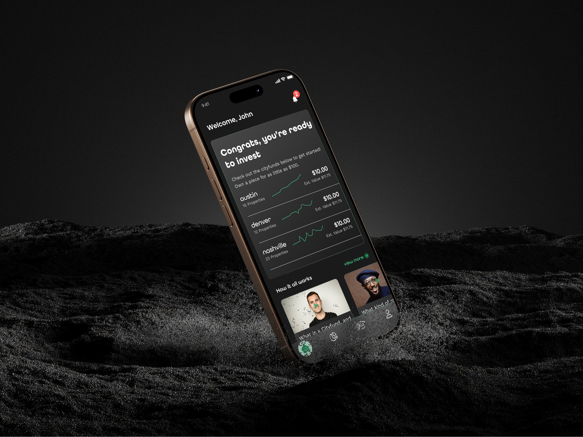
Nada Finance

Real Estate Investing Platform

UX Research | Product Design | Brand Identity | Product Management
WebsiteApp Store Listing

Summary

Nada is a fintech start-up currently in its series B. I was brought in as the Product Design Lead to take the generic UI kit purchased, bring it to launch, and iterate upon it to improve the user's experience. During my time on this project, the user base grew by 115%, WoW and investments by 237% WoW.

Please note that there are gaps in this case study due to non-disclosure agreements. I am happy to give more detail on this or any other project.

The Problem

The Nada executives developed a unique way to invest in Real Estate by developing "ETF-like" funds to invest in certain cities. They started their journey on Republic, but were ready to take the next step. Investing, Real Estate, and Nada's specific terms have steep-learning curves.

The Solution

I lead the charge to understand user pain points, stakeholder goals, and work with the dev team on bi-weekly sprints to implement best practices.

Responsibilities

  • User Research & Testing
  • Competitive Analysis
  • Informational Architecture
  • Wireframing & HiFi Mockups
  • Branding
  • Product Management

Nada's Background and Goals

Nada has ambitious goals for their product. Currently, they offer four cities in which the user can invest. Their goal is to expand this to 30+ cities within the following year. Investments in each city are through "ETF-like" funds called Cityfunds. A Cityfund is comprised of two property types. The first is single-family rental homes that Nada owns and rents. The second is family-owned properties, in which Nada invests in unlocking equity for the owner without monthly payments. These are called Homeshares.
Stakeholder goals included:
  • Launching the Nada Finance App
  • Growing the user base
  • increasing the number of investments

Research and Analysis

Nada has a solid user base that they interacted with via Discord. Therefore, I surveyed this cohort to understand who the users were and what their goals were.
Interesting Discoveries:
Since user growth was at the forefront of Nada's goals, I expanded my surveying efforts to non-investors to see Nada's strengths and weaknesses to the general public.

Key takeaways included significant pain points in the learned language Nada was providing. Cityfunds, Homeshares, and investing, in general, needed to be clarified to about 1/3 of the users surveyed.

I discussed the finding with the stakeholder and added goals to create more transparency and make the language more conversational.

Competitive Analysis

I conducted competitive analysis to understand current and future state competitors. For example, Nada's MVP state was more of a specific market, focused on ease of use, while their long-term goals brought them to competitors like Robinhood and Sofi. Therefore, I focused on the current state to ensure a solid foundation before moving forward.

Landa

Landa
Strengths:
  • Incredibly user-friendly
  • Lots of information and transparency on how share prices are created
  • Low entry investment
  • Web component
Weaknesses
  • Brand recognition
  • Secondary trading contingent on primary funding
  • Steep learning-curve
  • Secondary trading style is not in real-time
Opportunities
  • Online investing platforms are growing rapidly
  • Real-Estate is a hot commodity for investors
  • With lower cost homes and easy entry points, they can serve to a much boarder audience.
Threats
  • New investing platforms and investment types are becoming available every day
  • Real Estate investing is very dependent on market conditions
  • The level of transparency may make potential renters less likely to rent a Landa Property

AcreTrader

Acretrader
Strengths:
  • Alternative investment opportunity
  • Is user-friendly and easy to understand
  • Many investment opportunities for a diverse portfolio
Weaknesses
  • Brand recognition and understanding
  • Can be very complex and nuanced
  • Very high minimum investments for average investor
Opportunities
  • Farmland has become a very popular alternative investing type in recent years
  • Their accessibility and ease-of-use can help them standout vs other investment platforms
  • Attracts a different type of investor looking for socially responsible investing
Threats
  • The alternative investing market is becoming very crowded, and users make want to stick to something they have an understanding of
  • Farmland investing is very dependent on market conditions
  • Regulatory and legal changes can potentially limit offerings

Fundrise

Fundrise
Strengths:
  • Low investment entry
  • Provides detailed information about each investment opportunity, allowing investors to make informed decisions.
  • Offers a variety of investment options, including eREITs and eFunds
Weaknesses
  • Brand recognition
  • Can be very complex and nuanced
  • UI is not as appealing as other platforms
Opportunities
  • Real-Estate is a hot commodity for investors
  • With lower cost entry points, they can serve to a much boarder audience.
  • Large resource base to educate users
Threats
  • New investing platforms and investment types are becoming available every day
  • Real Estate investing is very dependent on market conditions
  • Regulatory and legal changes can potentially limit offerings

Testing and Key Improvements

The initial iterations I was given were very rough around the edges. They had some basic information but also added a significant amount of scope creep and unnecessary information that could cause some confusion to the user. These were the screens used at launch with the company ideal of "let's not let great get in the way of good."

While collecting data from our MVP I worked on improving user flows as well as a new design system and component library. I used this design system to update the flows for the V2 of the features we updated.
Nada Home
Original Homescreen
Nada Cityfund
Original Cityfund Screen
Nada Portfolio
Original Portfolio Screen
I used information from funnel.io to view gaps in in the app experience, as well as conducted usability tests to gain understanding of two essential functions: Sign up for an account, invest with confidence,. Success was not determined by completion of the scenarios, but getting a better understanding of the user’s struggles.

Scenario 1 - Onboarding

The onboarding flow for users in testing was adequate, but when reviewing the analysis, there was a significant drop-off between app download and completing sign-up.

I realized that users hesitated to give sensitive information to an app they didn't know much about. Instead, they wanted to "try before buying" to allow them to learn about how the app worked before committing. I researched the onboarding of successful apps that required sensitive information and developed the update below. This update included the ability for users to create an account with minimal information and then proceed to review the app before investing. Investing would require additional steps, but it was easy for the user to navigate to those screens.

Scenario 2 - Investing with confidence

The original Cityfunds screens had lots of information, but not necessarily the information users wanted to decide which city they felt most comfortable investing in. As a result, the flow for investing was lean but left a lot to be desired.

The updated Cityfund experience included updates about the cityfund, a breakdown of what made up the fund, and in-depth details about properties and share expectations. This update gave users more confidence in their investments and made them more comfortable with Nada and its transparency.

Final Thoughts

The Nada finance app came a long way during my time. Going from an idea to a fully launched product that users interact with daily. Taking the initial screens and iterating on them based on user feedback and analytical tools helped me improve the app's overall user experience. The inherited visual designs helped guide me to a more permanent design system that considers branding and accessibility standards.

Nada still has a long way to go in their journey, but the strides made during my time on this project helped immensely. Taking the ideas and goals of the stakeholder and matching them to the user's experience helped the product grow to another level. In addition, this project helped me learn a lot about managing niche markets and industries with steep learning curves. I look forward to watching Nada continue to grow.
Back to top button