
Incentivio started as a general white-label solution, but as more restaurants became clients, it became clear the product wasn’t designed with their needs in mind. The backend struggled to support multi-location operators, the admin portal was clunky and unintuitive, and the mobile apps—designed largely by developers—had major usability flaws.
Without a restaurant-first experience, Incentivio was losing clients to competitors who offered simpler, more intuitive platforms. To remain competitive and scale through Series A, the product needed to:
By solving these challenges, Incentivio aimed to give independent and regional restaurants the same competitive edge as enterprise chains like McDonald’s and Starbucks—without the cost of building their own product teams.

When I joined, Incentivio was in the middle of a major shift: the admin platform was being rebuilt in React, with the MUI design system serving as the foundation. While this gave the product consistency and development speed, it also meant that many UI components were pre-defined. My role was to push usability and clarity inside those constraints—focusing on solving real problems even when full visual freedom wasn’t possible.
To avoid “designing in a vacuum,” we introduced a structured design process with standups, ticketing, and review cycles between design, product, and engineering. I combined multiple research methods to ground our decisions in real data:
Alongside this, I worked with PMs to balance execution against shifting priorities—like executive-driven pivots to attract north star clients—while ensuring we never lost sight of restaurant operators’ day-to-day needs.
This marked a critical shift in the company’s design process: from one-off contractor deliverables to a continuous, feedback-driven loop that kept restaurants at the center.
Feature design and development followed an iterative process, incorporating user feedback at every stage. I collaborated closely with restaurant owners, internal stakeholders, and developers to refine the platform’s features and usability.
Each design phase began with wireframes and prototypes, tested with both restaurant operators and customers to validate flows like loyalty creation, checkout, and menu navigation. By incorporating feedback early, we ensured a seamless and intuitive experience.
I also worked closely with developers to translate designs into functional components, adapting to pre-built UI patterns and backend constraints. This required balancing ideal UX solutions with technical feasibility—without sacrificing clarity or usability.
“The shift from a clunky, confusing system to an intuitive, data-driven loyalty experience became a turning point for restaurant adoption."
One of the clearest examples was reimagining the loyalty experience from the ground up. The previous system was clunky, difficult to navigate, and often left restaurants confused about how offers were set up or how they were performing.
Through research and testing, we identified three priorities:
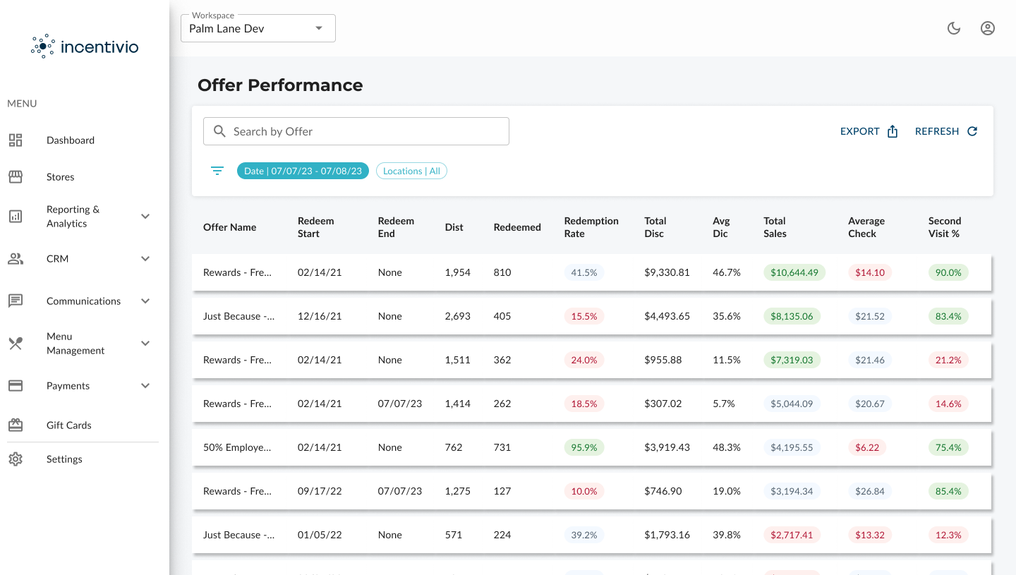
The result was a streamlined, intuitive flow for building loyalty programs—complete with tiered rewards, easy offer creation, and dashboards surfacing performance data at a glance. This not only reduced support tickets but also became one of the most beloved features for restaurants, directly improving retention and helping reduce churn by nearly 10%.
While loyalty became the flagship example, the same iterative process was applied across checkout flows, menu navigation, and the guest journey, each of which saw measurable improvements in usability and customer satisfaction.
Unlike a brand-new product build, my work at Incentivio began with a live platform already in use by restaurants. Rather than prototyping in a vacuum, I partnered with the customer success team and spoke directly with restaurant operators to uncover where they were struggling day to day.
This process surfaced critical pain points:

Because many visual components were pre-built, I focused on usability over polish—streamlining interactions, simplifying navigation, and clarifying language to reduce errors. Each redesign was then validated through real-world usage in production, with feedback loops from restaurants and client success confirming the improvements.
This shift—from working around a clunky legacy experience to creating intuitive, reliable flows—helped transform Incentivio into a platform restaurants could adopt more confidently, directly contributing to reduced churn and improved client satisfaction.

Loyalty was one of the most critical yet most problematic areas of the Incentivio platform. Restaurants relied on it to drive repeat business, but the old tools were either overly complex (offer creation) or too shallow (basic points system with no progression). The result: operators were frustrated, guests were underwhelmed, and the feature often went unused.
Through a complete redesign, we transformed loyalty into a flexible, intuitive, and motivating system—one that empowered restaurants to create sophisticated programs while giving guests a clear sense of progress and reward.

Creating a loyalty offer used to require navigating a rigid, confusing process. Operators had to wade through six separate steps—Basics, Points, Audience, Redemption, Availability, and Look—with little guidance or feedback. The steep learning curve led to errors, abandoned setups, and frequent support tickets.
We streamlined this journey by:
The result: operators could create effective loyalty campaigns faster, with more confidence, and with fewer calls to support.

Previously, the loyalty system was a flat points-for-rewards model. While functional, it lacked any sense of progression for guests or flexibility for operators.
We introduced Loyalty Tiers (e.g., Silver, Gold, Platinum), allowing restaurants to base progression on either total spend or lifetime orders. Each tier can be customized with thresholds, names, and unique benefits, allowing operators to reward their most loyal customers in meaningful ways.
Alongside tiers, we added Reward Milestones—smaller checkpoints, such as “50 points = free side” or “200 points = free entrée.” These intermediate rewards kept guests engaged and motivated between significant redemptions.
On the customer side, redesigned mobile screens displayed progress with visual trackers and tier indicators, making rewards feel tangible and within reach. For operators, dashboards gave clear insights into program adoption and performance.
Together, these changes elevated loyalty from a basic points system into a strategic retention engine—one of the most celebrated upgrades by restaurants during my time at Incentivio.

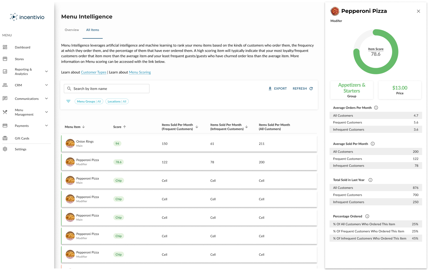
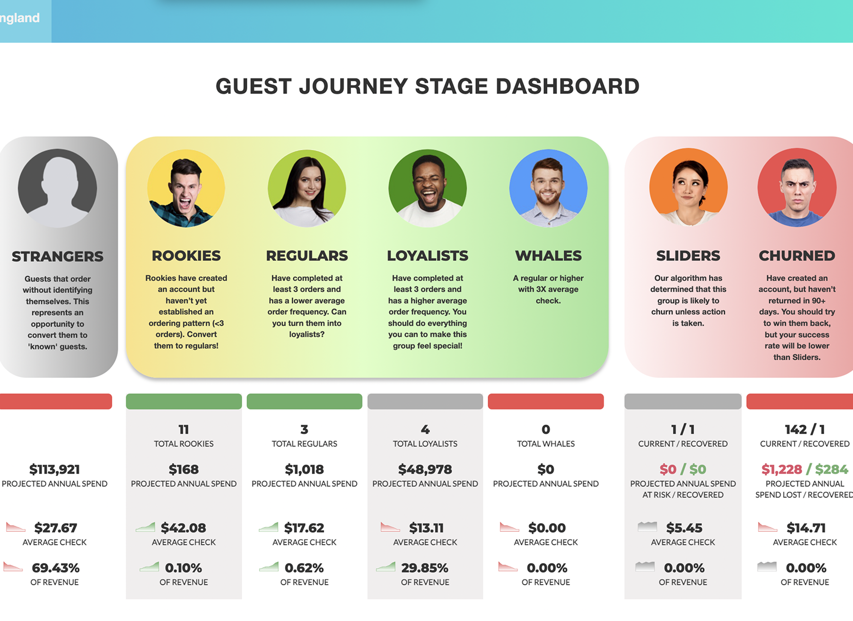
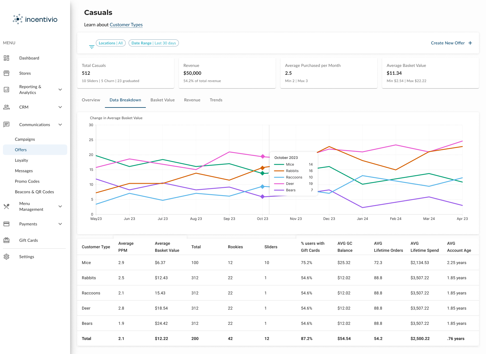
Despite its name, Guest Journey wasn’t a traditional design “user journey,” but a built-in Incentivio feature that restaurants relied on to understand customer behavior. Originally, it was limited to a static dashboard with broad categories that gave operators little actionable insight.
We redesigned Guest Journey into two dynamic views that transformed it into a powerful retention and upsell engine:

“Guest Journey gave operators the power to see where to intervene—and the confidence to act on it."
By layering these new perspectives with modernized data visualization, Guest Journey shifted from being a static report to an actionable decision-making tool. Restaurants could now:
The impact extended beyond the feature itself. Guest Journey became one of the most celebrated areas of the platform, directly contributing to higher restaurant retention and improving Incentivio’s NPS from 4 to 9. It gave operators not just data, but confidence—turning customer insights into business growth.

The original ordering experience left guests frustrated and restaurants missing opportunities. Using Heap analytics, we identified where customers were dropping off — most commonly during menu navigation and checkout — and validated new designs through Lyssna testing before rolling them into production. Within the first month of launch, restaurants across all sizes saw a 12% drop in abandoned carts and a measurable lift in average purchase size by 8%, proving the value of a streamlined experience.
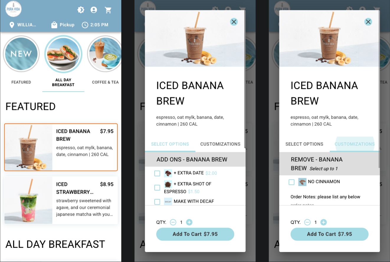
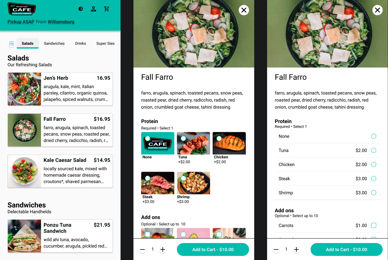
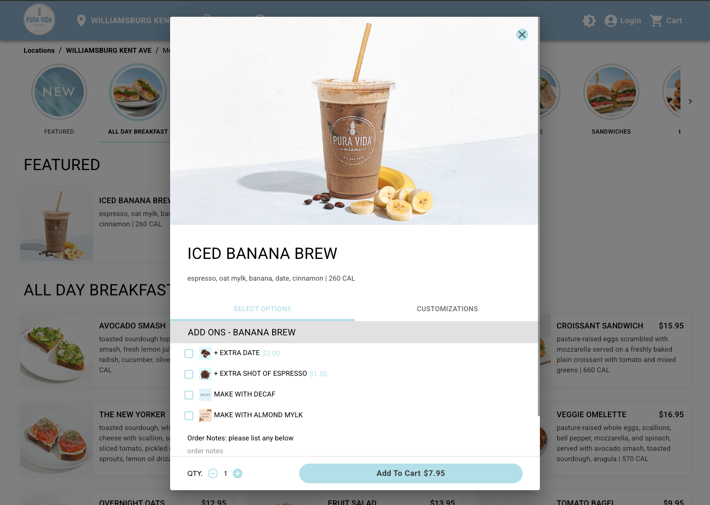
The old menu experience overwhelmed guests with oversized images for categories that pushed the actual items far down the page. Navigation was clunky, and on mobile, the design was even harder to use.
The redesigned menu emphasized what mattered most: the food itself. Categories became a slim, scrollable bar at the top, freeing up space for larger item images and clearer descriptions. Guests could now scan and select items quickly, with consistent responsiveness across devices. Modifier submenus were also reworked into two flexible layouts — an image-based view for restaurants that wanted visual upsells, or a clean list view for those prioritizing speed. This shift made customizations intuitive and ensured modifiers were never hidden.

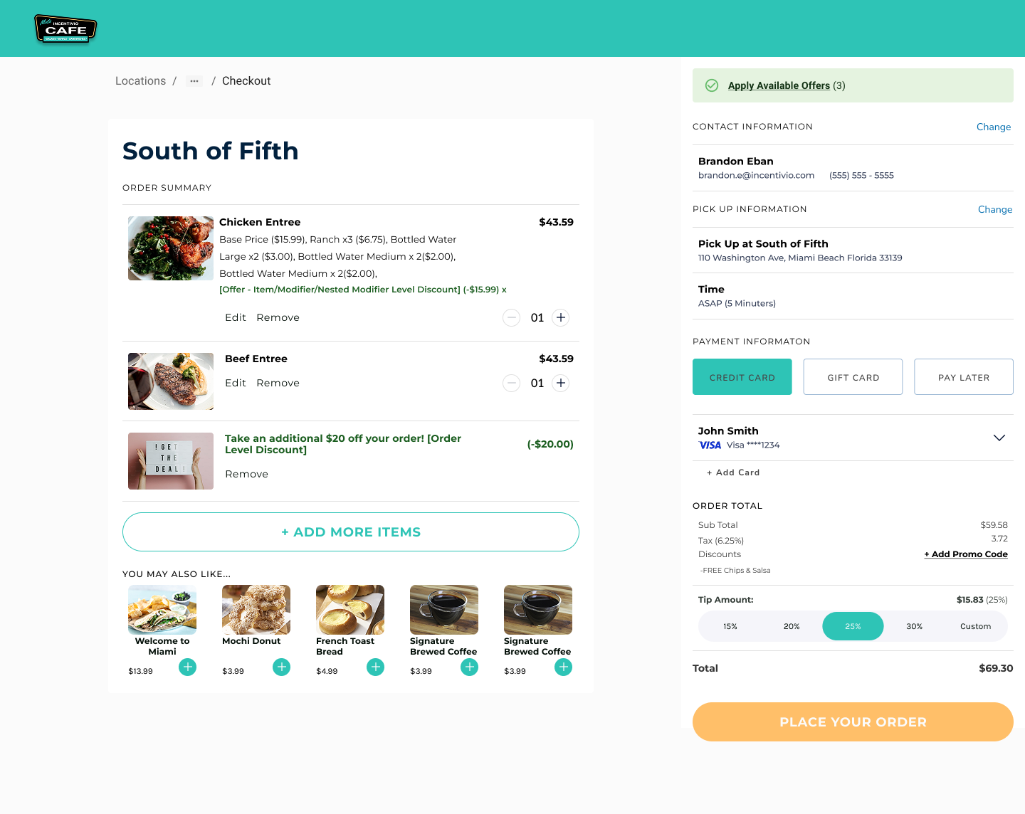
The original checkout buried essentials in a sea of empty space and long forms. Guests had to scroll endlessly to confirm details, upsells were hidden, and payment inputs felt clunky.
The new design consolidated all critical information into a clear, scannable layout. Order details, totals, and pickup/delivery info were grouped logically, with tipping and promo code entry placed where guests expected them. Upsells were given a defined space in the flow, improving add-on visibility. On mobile, checkout was split into two digestible steps — Your Order and Order Review — reducing cognitive load and making it easier to complete purchases on the go.
This redesign directly addressed cart abandonment and revenue growth: 12% fewer abandoned carts and 8% larger average order size within the first month, results that held steady across both small independents and multi-location restaurant groups.

Our redesign work at Incentivio transformed the platform from a clunky, error-prone experience into a set of intuitive, confidence-building tools for restaurants and their guests. By focusing on usability over polish, validating with real operators, and testing with live customers, the results were immediate and measurable.
.webp)
Working within an already live platform meant I had to move fast, respect engineering constraints, and design in a way that felt both iterative and pragmatic. Using MUI pre-built components meant less freedom visually, but it forced me to sharpen my focus on usability, clarity, and consistency over surface-level polish.
I also learned that direct client and end-user feedback trumps assumptions. Partnering with customer success and talking to restaurant operators exposed pain points (like loyalty confusion and cart abandonment) that analytics alone couldn’t have uncovered.
The biggest takeaway was that small usability improvements scale massively when applied across hundreds of restaurants: one tweak in the menu or checkout experience wasn’t just a design win, it directly impacted conversion, order size, and client satisfaction across the platform.

If I could do it again: I would have pushed earlier for dedicated usability testing cycles with real end-customers, not just operators and client teams. That would have given me more direct insight into how diners experience the platform and allowed for faster iteration on the customer-facing side.


